Showing posts with label amy holliday. Show all posts

Monday, 13 May 2019

Watercolour DNA // Somatic Cell Illustration Process

Continued watercolour cell illustrations for a bio-engineering client. This time to produce organic, fluid and beautiful-looking DNA helices. 

Initial concept sketches: To help produce these designs, the creative team continually request additional input from working scientists, who help to ensure the images being portrayed remain somewhat realistic and scientifically-correct.


When the shape and style of the helix had been determined, the next stage was to find the most effective way to add colour.


In addition to a vertical helix, a horizontal design was also suggested:


The final, finished illustrations are... a bold, vertical helix shape in turquoise and purple with chartreuse-green and fuchsia-pink highlights:


...with an accompanying horizontal perspective using a similar colour-theme:


Artwork (C) Amy Holliday 2019

Tuesday, 12 April 2011

Milk Packaging Completed

I went back and added more colour to my typeface to give it more of an impact and to complement the colour scheme of the illustrations. I painted over the top of my pencil drawing in Photoshop:


 Today I finished photographing my milk carton designs and point of sale stand, which completes the uni brief of illustrating/designing milk packaging that is aimed at children and parents.


I also finished building my website! http://www.amyholliday.co.uk

Wednesday, 6 April 2011

Hare Tattoo

I did a quick tattoo design for a friend, she asked for "a silhouette of a slender looking hare/rabbit". I started by making studies of hares and possible positions for it before asking her to choose which one she liked the best. I then worked on the chosen design to establish cleaner lines before going over it in pen.

She is very pleased with the result!

Thursday, 10 March 2011

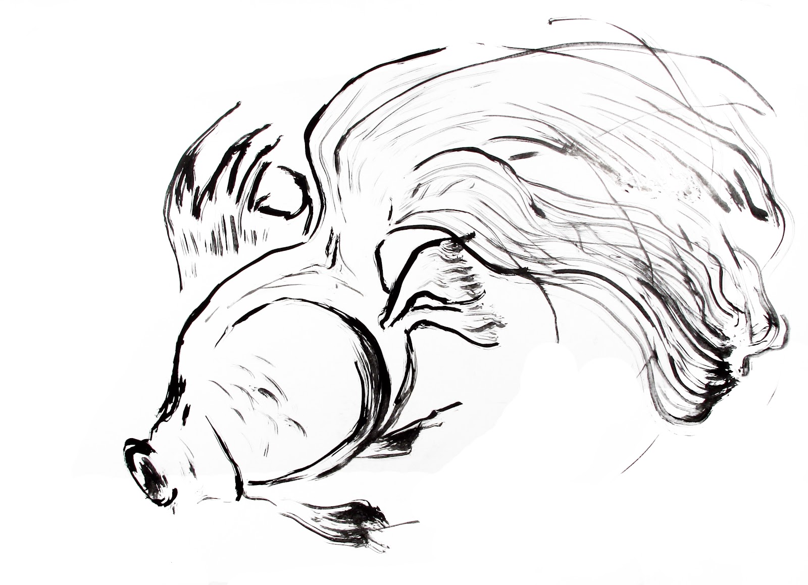
Fish Studies: Exploring movement through drawing, watercolours and ink.

I set myself the personal brief of capturing the fluidity and movement of fish. I decided to use a local pet shop for reference so I took my sketchbook along to do some studies of their various types of goldfish. 
 

I was also interested to find out how I would illustrate their transparency using my watercolours, so when I got home I added colour to the sketches:


I wanted to recreate the sense of life my initial pet shop drawings had and so it was suggested to me that I work at a very large scale and draw with very fluid lines. I used India ink and a large paintbrush on A1 (ish) sized card to produce new, very large, fish drawings:  


I experimented on some of the large scale ones with coloured inks, before altering the black ink lines in Photoshop to add more colour:


I then wanted to see if I could simplify the fishes' design so I restricted myself to only a few lines:


One of the tutors at my university wanted a photograph of my ink-fish obsession for the blog, and got me to lay them out around the studio! You can get a feel for how big each piece actually is!  (Click for a bigger view)


After photographing the large ink drawings, I printed them at A4 and A3 and experimented with my watercolours on top of them:


I found that I wanted to add colour to the whole of the image including the black lines, so I used Photoshop to add colour and after scanning in some separate watercolour textures, brought the two elements together:


I was now feeling like I was getting closer to a more polished outcome with my ink designs. I then completed a series of compositions and patterns to show the finished fish designs off:

I played around with other colours too; such as these reds for the moors, but I found they weren't "watery" enough in comparison to their blue versions.


Thursday, 13 January 2011

Puffin Book Cover for "James and the Giant Peach"

Brief: produce a book cover for Roald Dahl's James and the Giant Peach that would not look out of place both on the shelf of an upmarket bookstore or at the local supermarket.

I explored many idea pathways for this brief, starting with:
The Characters:


The Peach:


 The seagulls and the sky:


Developing the Cover:


Further work:

After receiving feedback, I was asked to go back to my nighttime peach scene. I worked more on this and produced another, completely different cover: