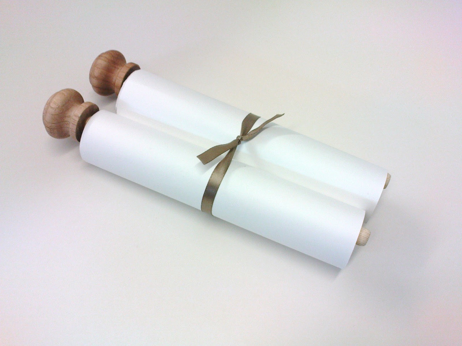
I finally got the chance to finalise my camels project, by making my desert mural into a scroll! I wanted to have some kind of artefact that can both present the illustration and at the same time have a tactile quality or be something to hold. At first it seemed like the whole idea wasn't going to work at all, but after finishing it, I am very happy with it. I took the chance to get some photos, just in case it gets ruined while the work is being marked!
Wednesday, 18 May 2011
"Crow's Fall" Exhibition Banners
To present my finished Crow's Fall poem illustrations, I made a digital "mock-up" for how the banners might appear in a public space, such as a book store or an exhibition celebrating poetry.
Labels:
banners,
crows,
exhibition,
mockup,
poety,
ted hughes
Saturday, 14 May 2011
Horticulture
For my final project of the semester, and my final university project ever(!) I was asked to create a "man-made" font, due to the fact my tutors wanted to see me illustrate something that was not of the natural world for a change haha.
I ultimately decided to base my new typeface on the very interesting, old, rustic-looking gardening tools my parents have in thier garden shed.....I scanned most of my pencil drawings before I began to add colour to them: (click to enlarge)
After producing studies, I began to shape the tools into letterforms in order to make up a word to present my font:
Final piece: (click to enlarge)
I ultimately decided to base my new typeface on the very interesting, old, rustic-looking gardening tools my parents have in thier garden shed.....I scanned most of my pencil drawings before I began to add colour to them: (click to enlarge)
After producing studies, I began to shape the tools into letterforms in order to make up a word to present my font:
Final piece: (click to enlarge)
Labels:
font,
garden tools,
gardening,
hand-drawn,
hand-drawn typography,
horticulture,
letterforms,
lettering,
tools,
type,
typography
Monday, 9 May 2011
The Goldfinches and the Lovebird
I was recently asked to contribute to a school's auction in the form of a commission (yay! my first proper commission!!) to produce an illustration similar to my previous fish and budgie studies. To make sure the outcome would be similar, I decided to illustrate a lively and colourful bird.
I produced a number of goldfinch studies; the idea being the most successful would be the commissioned piece.
However after doing these, I was very unsure about their duller colours! And so I did one more, this time a lovebird, which i'd recently seen at the pet shop where I did my budgie studies.
In the end, I chose the lovebird to submit as the commissioned piece. As a form of self-promotion, I included a small plaque featuring information about me, as well as a stack of business cards for anyone at the auction who may be interested in my work. As this was my first attempt at a business card, I feel they could be improved upon in the future. I plan to re-do them and one change I will make is making my contact details larger!
I produced a number of goldfinch studies; the idea being the most successful would be the commissioned piece.
However after doing these, I was very unsure about their duller colours! And so I did one more, this time a lovebird, which i'd recently seen at the pet shop where I did my budgie studies.
In the end, I chose the lovebird to submit as the commissioned piece. As a form of self-promotion, I included a small plaque featuring information about me, as well as a stack of business cards for anyone at the auction who may be interested in my work. As this was my first attempt at a business card, I feel they could be improved upon in the future. I plan to re-do them and one change I will make is making my contact details larger!
Labels:
birds,
commission,
goldfinch,
lovebird,
pets,
watercolour
Tuesday, 12 April 2011
Milk Packaging Completed
I went back and added more colour to my typeface to give it more of an impact and to complement the colour scheme of the illustrations. I painted over the top of my pencil drawing in Photoshop:
Today I finished photographing my milk carton designs and point of sale stand, which completes the uni brief of illustrating/designing milk packaging that is aimed at children and parents.
I also finished building my website! http://www.amyholliday.co.uk
Today I finished photographing my milk carton designs and point of sale stand, which completes the uni brief of illustrating/designing milk packaging that is aimed at children and parents.
I also finished building my website! http://www.amyholliday.co.uk
Labels:
amy holliday,
cattle,
cows,
illustration,
milk,
packaging,
typography,
uni work,
year 3 work
Saturday, 9 April 2011
Tourist "Camel Trek" Camels of Tunisia & the Sahara Desert
The series was inspired by last summer's visit to Tunisia and a Camel trek in the Sahara desert! I worked from photographs which supplied a change from my recent life studies. I wanted to capture the atmosphere by showing distance through differences in scale and conveying the variety of textures.
Click to view full-size images.
Here are some early camel drawings and rug patterns; I found coloured pencils brought out the surface of the paper underneath which created quite a believable fabric texture:
I incorporated my rug patterns into the drawings:
I experimented with different ways of drawing the camels. The elongated shadows and different viewpoints can make the desert seem a very alien environment, especially at sunset:
I focused on the foreground details and textures for some up-close camels:
The final composition: (click for larger view!)
Click to view full-size images.
Here are some early camel drawings and rug patterns; I found coloured pencils brought out the surface of the paper underneath which created quite a believable fabric texture:
I added colour as well as textures, experimenting with various implements and techniques until I got the hot, dusty atmosphere I desired:
I incorporated my rug patterns into the drawings:
I experimented with different ways of drawing the camels. The elongated shadows and different viewpoints can make the desert seem a very alien environment, especially at sunset:
I focused on the foreground details and textures for some up-close camels:
The final composition: (click for larger view!)
2012 Edit: The evolution of a project! This is a good step by step example of how I work and progress through a project, from early drawings, to experimental stages, to producing many studies of the subject before selecting the best to use for the final illustration(s).
Labels:
amy holliday camels tunisia desert douz,
atmosphere,
camel,
camel trek,
dust,
dusty,
dustydesert,
evolution,
guide,
heat,
holiday,
hot,
illustration,
project,
sahara tourist,
sand,
step by step,
watercolor,
watercolour
Wednesday, 6 April 2011
Hare Tattoo
I did a quick tattoo design for a friend, she asked for "a silhouette of a slender looking hare/rabbit". I started by making studies of hares and possible positions for it before asking her to choose which one she liked the best. I then worked on the chosen design to establish cleaner lines before going over it in pen.
She is very pleased with the result!
Subscribe to:
Posts (Atom)