Wednesday, 24 September 2014

Study // Plump Purple Aubergine (Eggplant)

Another veggie produce study. This time plump, purple Aubergines. These were very experimental, it was quite a challenge in itself to decide which colour hues I was going to use.  


Images (C) Amy Holliday 2014. Please do not use without permission.

Thursday, 11 September 2014

Throwback Thursday: Lovebirds

Here is a zoom-in on a pair of bright and happy love birds from 2011. Mrs Lovebird (on the left) was part of a private commission, and Mr Lovebird (on the right) was just for fun. I still have the original painting for Mr Lovebird, which is for sale in my Etsy shop.

Friday, 29 August 2014

Study // The Finest Red Ramiro Sweet Pointed Peppers

More fresh fruit/veg/food/produce studies :) Another self-initiated lesson in painting with red. Heavily inspired by the sweetest red peppers I have ever tasted, the organic kind are the best of course. Ahem, other supermarket brands are available!


Artwork is (C) Amy Holliday 2014. Please do not use without permission. 

Monday, 18 August 2014

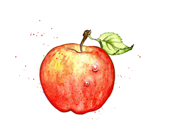
Study // Red Royal Gala and Green Granny Smith Apples

Yummy Royal Gala and Granny Smith apples study. I tackled these with a slightly more botanical/scientific approach...


I loved painting these! Can you tell? 


Monday, 11 August 2014

Study // Fruit: Juicy, Tropical Pineapples!

Pineapple study! Pineapples are a symbol for all things tropical and exotic so I hope I have captured this in some way. 


It feels good to finally have a few recent personal workings scanned and finished - there has been a number of illos around my desk that I've been meditating on before I've been ready to call them truly finished. 


More coming very soon...

All content and images (C) Amy Holliday 2014 - please do not use without permission.

Study // Cherry Tomatoes on the Vine

Personal portfolio/self development work.

Yummm. This tomato study turned into a bit of a painting lesson. After scanning the finished painting I found that I wasn't overly happy with it. The tomatoes were just not red enough! I decided to re-visit them, and this time really focus on getting that rich, ripe, firm and fragrant tomato colour. I realised that in order to get the richness I was hoping for, they needed a LOT more paint. I ended up finishing a second set too which I prefer more than the first! Let me know what you think :)


All content and images (C) Amy Holliday 2014. Please do not use without permission. 


Friday, 8 August 2014

Better Homes and Gardens: "Live Well" // Photo Frames, Car Keys and Swimming Pools

The second of the two articles I worked on in the July issue of Better Homes and Gardens US magazine. For the "Live Well" section, I contributed four small spot illustrations to accompany the content.


As with the Better Health illustrations, these also required a consistent colour palette to compliment the page theme. I love those fancy "fine art" photo frames! Here they are as they appear in the magazine:


:: Process and Roughs...
Here's a variation on the car keys that didn't make the final cut.


If you missed yesterday's post on the Better Health article, you can find it here!

Thank you for reading! Please let me know what you think, I'd love to hear your thoughts.


All artwork is (C) Amy Holliday 2014 please do not use without permission.